2015-26

CRU
Naming, Branding & Copywriting

Una marca construida en torno al momento previo a que las cosas se hagan definitivas.

CRU es una plataforma omnicanal —que incluye espacio físico y comercio electrónico— diseñada para creadores de cerámica. Proporciona materiales y herramientas, pero, sobre todo, se posiciona como un compañero en el acto de crear: cerca del proceso, cerca de las manos que dan forma a la pieza.

La marca se expresa desde dentro del taller. Replantea la categoría, no como una industria técnica, sino como una práctica creativa.

“The concept draws from that fragile instant when clay
is still soft—when form is undefined, when mistakes
are still possible, and when intention has not yet
hardened into outcome.”

CRU no se trata de la pieza terminada. Se trata del estado previo a la misma.

Esta idea se convierte en el fundamento de la marca. No como una metáfora, sino como una forma de pensar: todo existe en constante evolución. Todo está sujeto a cambios.

CRU considera la experimentación, el error y la incertidumbre como elementos esenciales de la creación. Cambia el enfoque, pasando de la precisión a la exploración, del control al descubrimiento.

La marca no promete la perfección. Lo que hace es validar el acto de crear.

“A voice that stands next to the creator.”

We developed a tone of voice that moves away from the authority of the supplier and closer to the reality of the workshop.

CRU speaks from within the process. Direct, human, and unfiltered. It doesn’t instruct—it accompanies.

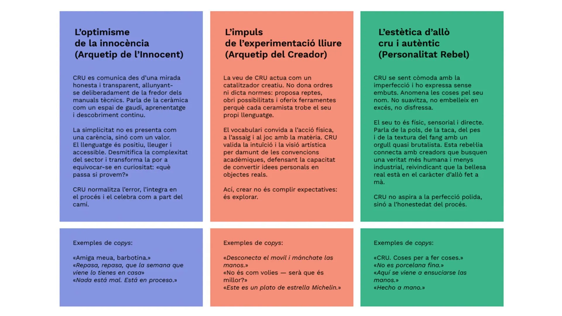
At its core, the narrative is built on a simple shift: ceramics does not begin in technique. It begins in the creator.

From there, the voice is shaped through three tensions:

The innocence of making.

A language that is light, honest, and accessible. Simplicity is treated as a value. Mistakes are not corrected—they are integrated.

The impulse to experiment.

A voice that opens possibilities instead of defining rules. It invites action, play, and physical engagement with the material.

The rawness of the material.

A tone that is tactile and unapologetic. It speaks of dust, stains, weight, and texture without polishing them.

This system allows the brand to move—from poetic to practical—without losing coherence.

The result is a voice that doesn’t explain ceramics. It makes you want to touch it.

“A simple structure makes it usable.”

A simple structure makes it usable.

The website translates the identity into a single, clear interface.
Designed as a one-page platform, it brings together the core elements of the Observatorio: events, community, and publications. The structure is intentionally simple. Navigation is direct, and content is framed with the same logic as the visual system.
It functions as a working tool—useful, legible, and aligned with the purpose of the platform.
The result is a brand that operates as a system: clear in its construction, flexible in its application, and consistent across touchpoints.
An identity that does not attempt to define cultural marketing, but provides the framework to understand it.
A way of looking, before a way of speaking.