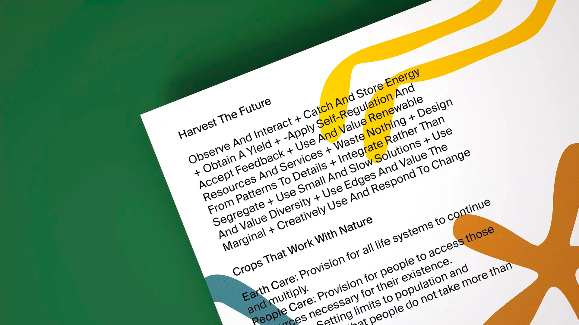
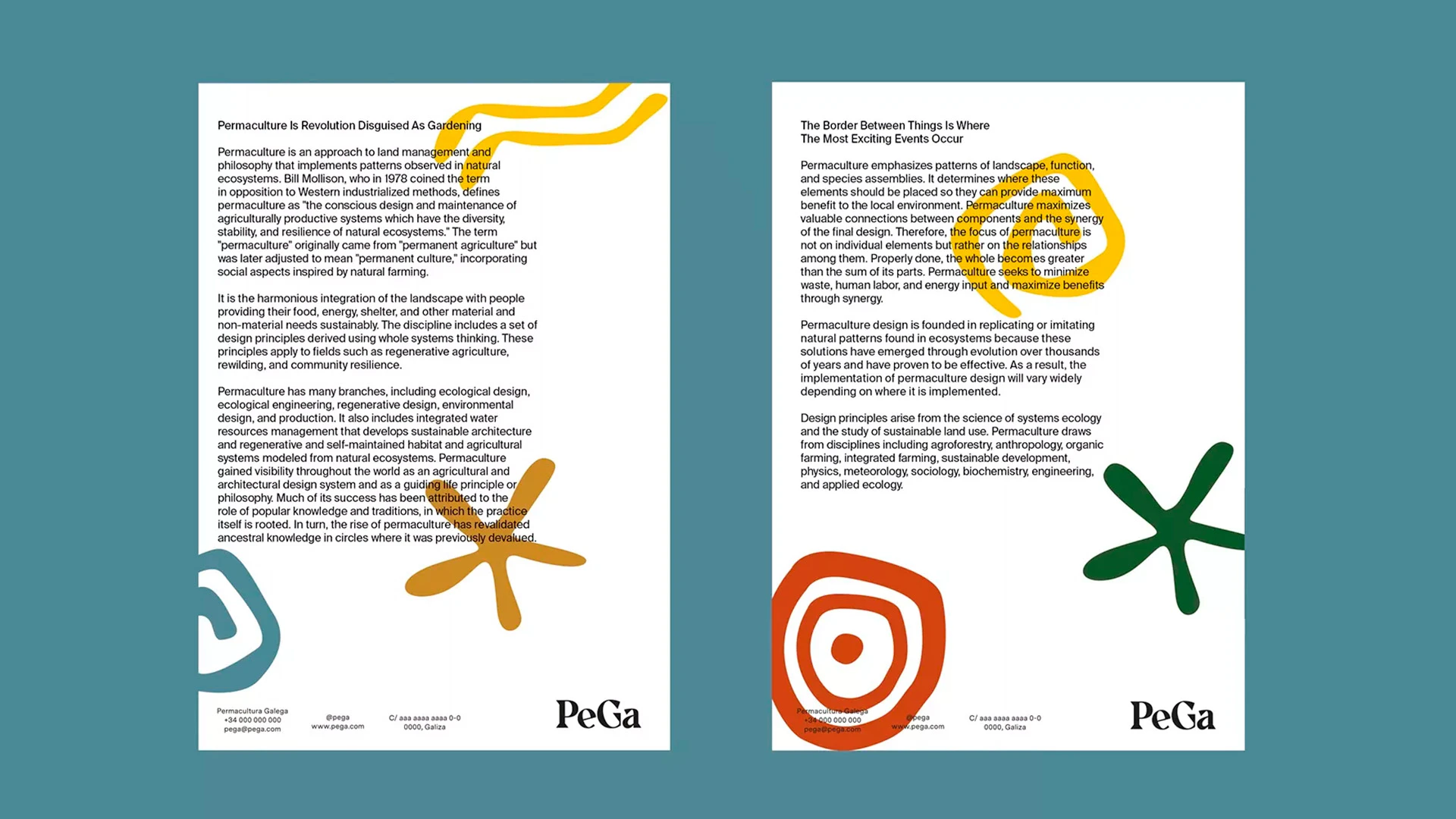
The chosen typeface, Suisse Int’l Regular, although considered a plain sans serif, in this case, proves to be the most robust counterpart for Chromate.
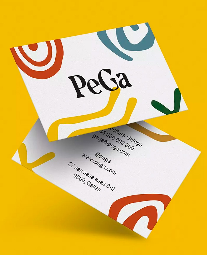
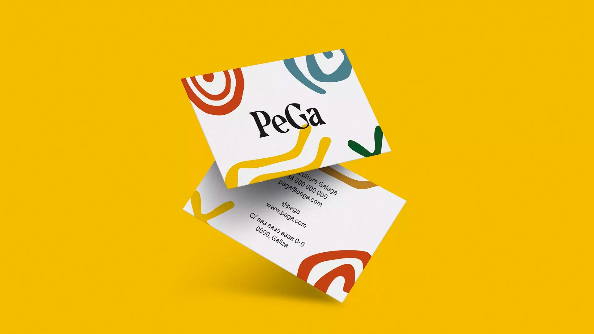
A series of colorful brand shapes representing the architecture of permaculture design is added to the logo. The earthy color palette takes inspiration from the local forests, rough weather, and fabled terroir. The result is a bold and colorful brand identity with a cohesive brand architecture able to hold PeGa’s experimentation, dissemination, education, and production initiatives together.