CHRISTIAN SIMMONS, RENAISSANCE
Art Direction & Copywriting
For Christian Simmons’ independently produced collection “Renaissance,” REGULAR ANIMAL developed the visual identity and communication system surrounding a collection built around transformation, destruction, and emotional reconstruction.
Presented at Madrid’s Circo Price following the designer’s earlier participation in the EGO platform for emerging designers, “Renacer” explored the idea of rising from personal collapse — learning through pain and converting vulnerability into beauty.
The project approached fashion communication not as promotion, but as symbolic narrative construction.
“Beauty rebuilt from ashes.”
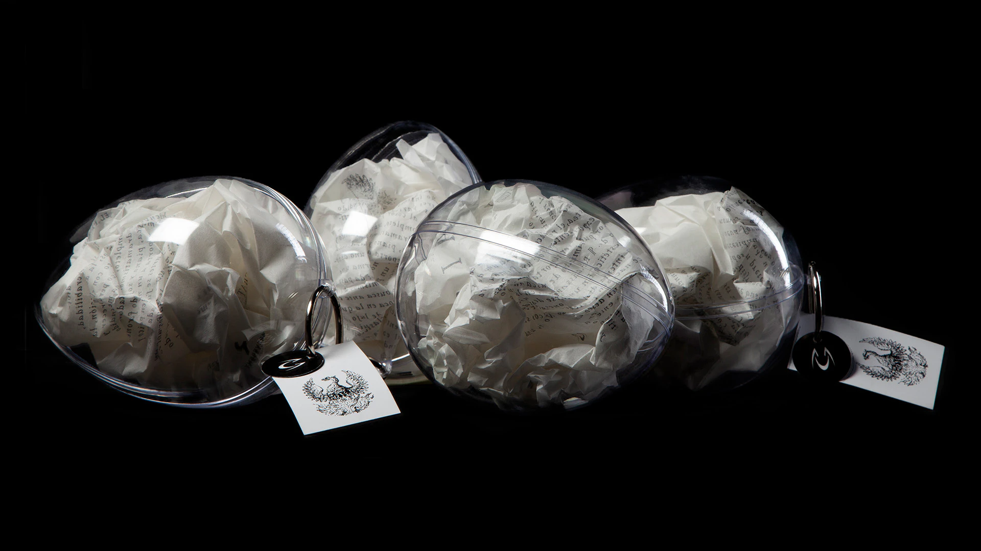
At the center of the identity system was a pixel-constructed phoenix logo: a fragmented symbol of rebirth merging digital language with mythological imagery. The visual universe intentionally balanced fragility and reconstruction, combining raw textures, distorted typography, and religious editorial references.
Rather than creating polished luxury materials, the communication embraced imperfection, tension, and emotional residue.
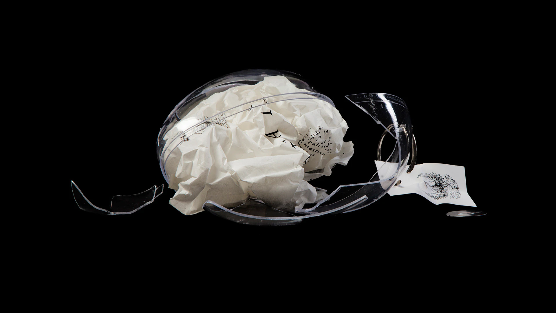
The central piece was a transparent egg, XX cm tall, designed to be physically broken in order to reveal the collection’s information hidden inside. Contained within it was an XX by XX poster printed on wrinkled bible paper featuring fragments of the collection’s conceptual narrative. The object transformed the press kit into something closer to a ritual artifact — fragile, devotional, and almost archaeological in nature.
“Rebirth understood as rupture before reconstruction.”
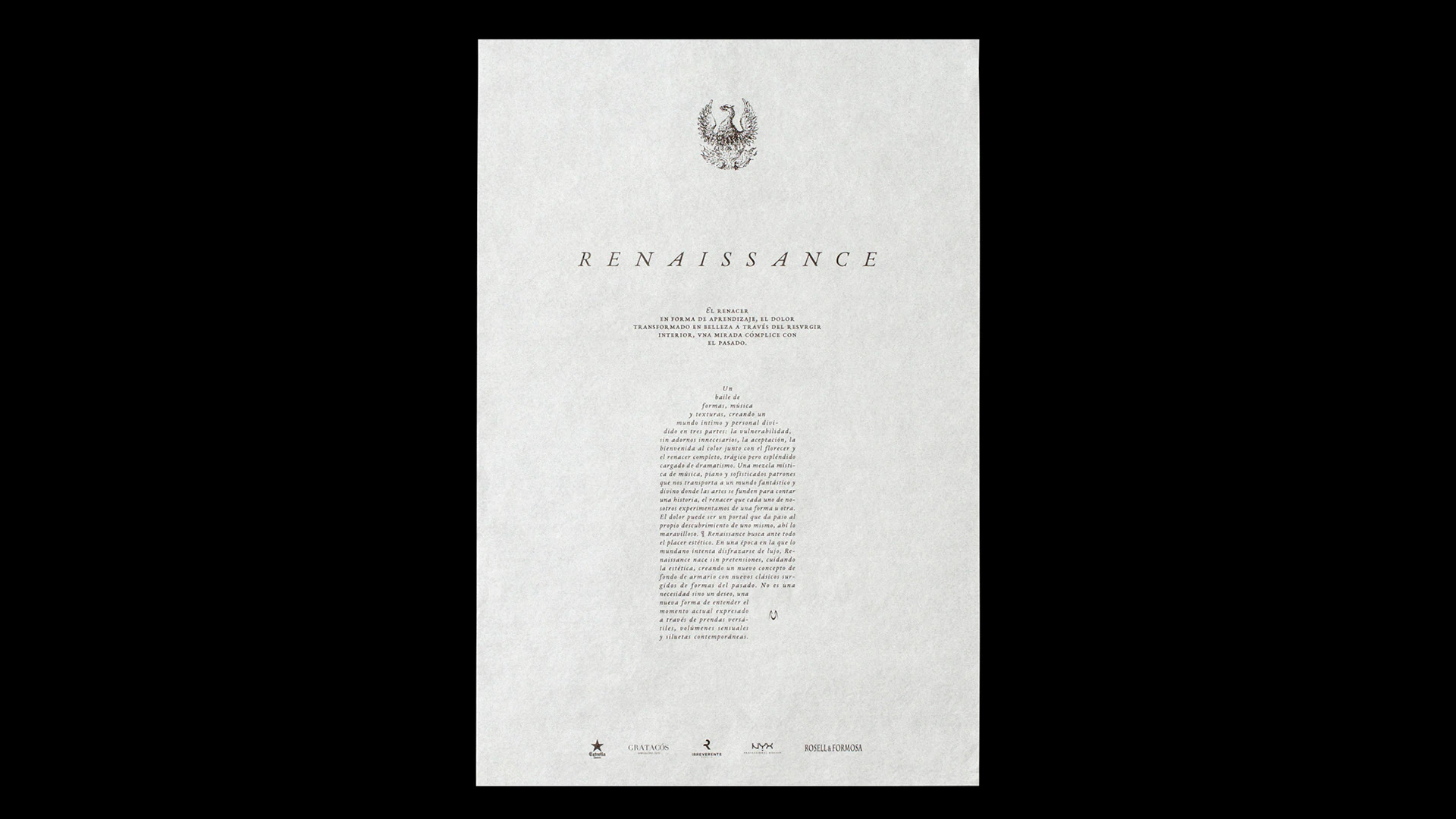
Part of the graphic system drew inspiration from historical bible layouts and experimental religious typography from a specific editorial era. The project referenced the work of modern ecclesiastical designers who disrupted traditional composition systems through angular structures, pyramidal markers, and sharp typographic peaks replacing conventional linear text arrangements.
These references were reinterpreted through a contemporary lens, creating a visual language that felt simultaneously sacred, digital, and unstable.
- The communication materials became an extension of the collection’s emotional architecture:
- Pixelated phoenix iconography symbolizing reconstruction
- Conceptual texts printed on crumpled bible paper
- Editorial compositions inspired by experimental religious typography
- Raw printed materials embracing texture, folds, and imperfection
- A visual system balancing spirituality, collapse, and rebirth
“The collection existed somewhere between devotion, destruction, and reconstruction.”
Rather than separating identity from collection, the project blurred the boundaries between fashion, symbolism, and emotional storytelling. Every graphic decision reinforced the central narrative of transformation: the idea that pain, fragmentation, and collapse can become the material from which new identities emerge.
The result was a communication system that extended the collection beyond the runway and transformed its conceptual core into a tactile and visual experience.