AGRIS
Art Direction, Brand Identity & Graphic Design
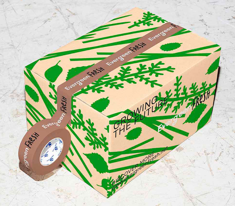
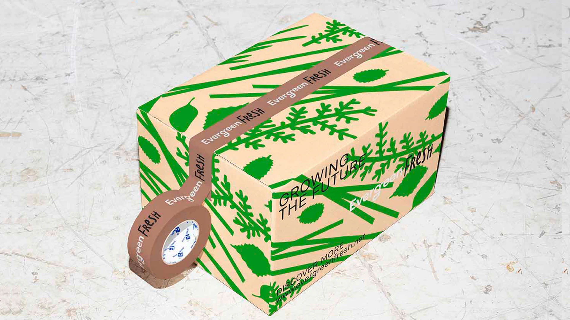
Agris needed a rebrand that would reflect their comprehensive agricultural solutions, moving away from the perception of being a niche player and positioning them as a leader in sustainable agriculture.
Our mission was clear: to help Agris tell their full story through a fresh, unified brand identity.
The visual identity emerged from a strategic discovery process rather than a predefined design direction.
With a clear strategic foundation in place, the next step was to translate that insight into a visual identity that could support Agris' future growth.
The new logo design revolves around a simple but powerful symbol: a seed.
The core of Agris’ new brand identity is rooted in the use of Basier Circle, a modern sans-serif typeface that reflects Agris’ professionalism and forward-thinking approach.

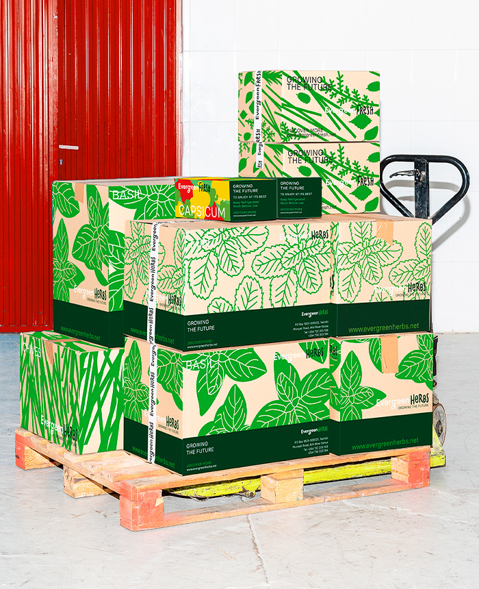
A brand becomes more memorable when its visual language extends beyond a logo.
Agris’ new identity is a testament to their growth and evolution. The rebrand does more than just refresh their image—it tells the full story of who they are and what they stand for.