OBSERVATORIO DE MARKETING CULTURAL
naming, Branding, Web & copywriting
Una identidad de marca construida a partir de la arquitectura de un observatorio astronómico.
El Observatorio de Marketing Cultural fue concebido como una plataforma independiente para explorar la relación entre marketing y cultura.
Su no es solo documental, sino también interpretar: comprender cómo las marcas participantes en los ecosistemas culturales y cómo la cultura, a su vez, remodela el papel del marketing en la sociedad contemporánea.
El reto consistía en crear una identidad capaz de albergar tanto análisis como expresión: rigurosa en su estructura, pero abierta en su perspectiva.
“The identity begins with a way of looking.”
Rather than referencing it symbolically, the project takes the structural logic of a stargazing observatory as a starting point. An observatory is designed to frame the unknown—to create the conditions for observation, analysis, and interpretation.
This principle informs the entire system: a defined geometry, a controlled aperture, a way of looking.
The brand does not depict culture or marketing—it defines a framework for observing how they intersect.
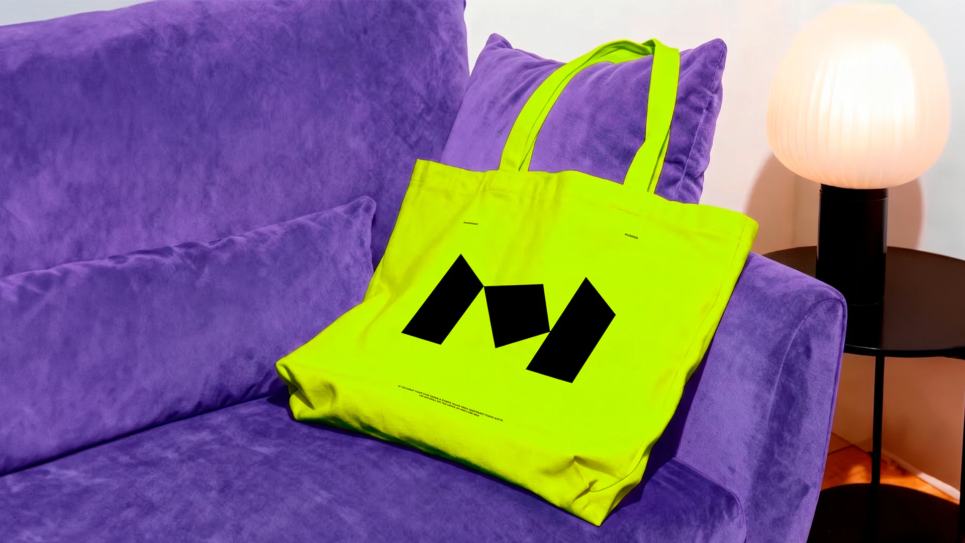
The logotype is constructed from the shape of an actual observatory dome, translated into a modular composition. Its fragmented appearance reflects the nature of the platform itself: a space where different elements—data, ideas, and contexts—come together to form a broader understanding.
The relationship between symbol and wordmark is governed by a precise system of proportions, ensuring consistency across formats and scales. The result is a mark that is both structural and interpretive—grounded, but open.
“Structure brings clarity. Everything else is reduced.”
The typographic system is built around Inter. Its clarity and neutrality reinforce the analytical nature of the Observatorio, while its versatility allows for consistent use across digital and printed formats.
Regular weights are used for reading, with bold cuts reserved for emphasis. Hierarchy is defined through composition rather than stylistic variation.
Color introduces contrast into an otherwise controlled system. The palette is defined by acid green, orange, and violet, balanced by off-white and black.
Rather than behaving decoratively, color is used to create tension and focus. Each tone carries a role: intensity, visibility, reflection. Off-white acts as the primary field, black provides structure, and color appears selectively to guide attention.
The system remains dynamic without losing coherence

“A simple structure makes it usable.”
Su estructura simple lo hace utilizable.
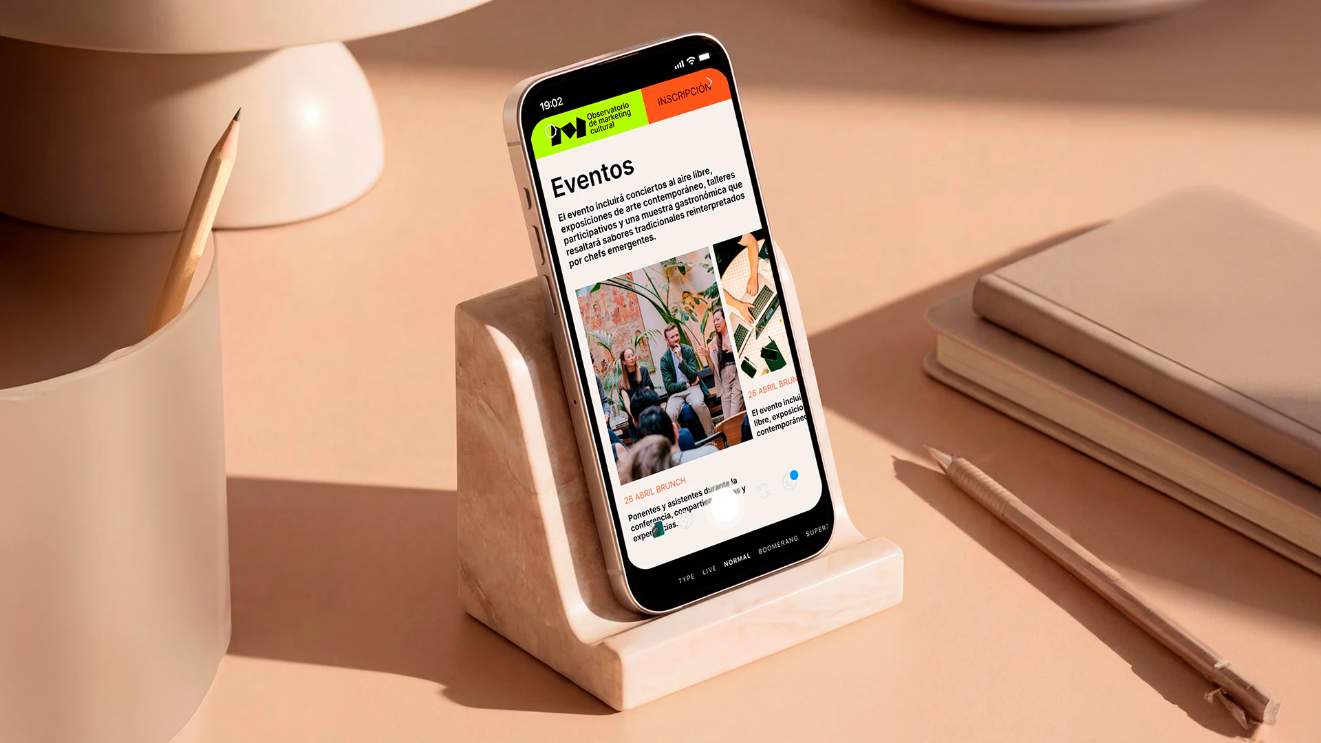
El sitio web plasma la identidad en una interfaz única y clara.
Diseñado como una plataforma de una sola página, reúne los elementos centrales del Observatorio: eventos, comunidad y publicaciones. Su estructura es intencionadamente sencilla. La navegación es directa y el contenido se estructura con la misma lógica que el sistema visual.
Funciona como una herramienta de trabajo: útil, legible y alineada con el propósito de la plataforma.
El resultado es una marca que opera como un sistema: clara en su construcción, flexible en su aplicación y coherente en todos los puntos de contacto.
Una identidad que no pretende definir el marketing cultural, sino que proporciona el marco para comprenderlo.
Una forma de ver, antes que una forma de hablar.