Amplifiers in Three Acts
Imagine you want to build a collection of amplifiers from scratch. Imagine each one with its own personality and tone. Now imagine working with a creative agency to design distinctive branding for each, so they stand apart yet belong together. Well, someone did.
The Brief
How do you give identity to sound itself? That was the question at the heart of this project: create a branding system for a trio of amplifiers, each engineered with a distinct sonic personality, yet all belonging to the same collection.
Each amplifier was conceived with a clear character — agile, elegant, or rebellious. Our task was to translate those tonal identities into a coherent visual system that could express individuality without losing harmony across the collection.
The Inspiration
The inspiration came from sound itself — from the physics of vibration and the poetry of tone. From the way a single note bends under pressure, slipping into a blue note. From the way distortion blooms at high gain, transforming precision into chaos. From the shimmer of harmonics that linger just on the edge of silence, like ghosts in the circuitry. Each amplifier was built with its own tonal character, a voice designed to fill a different space in the spectrum:
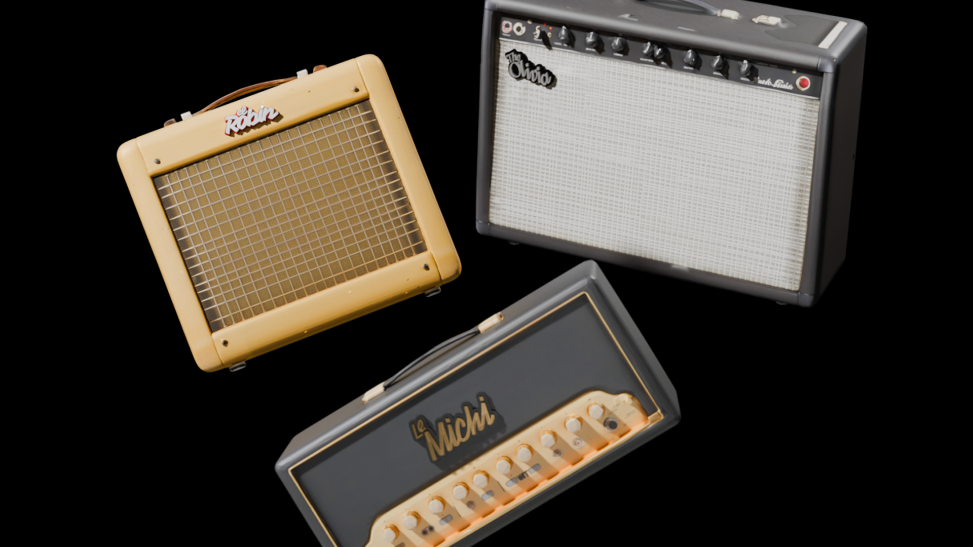
- Le Michi: agile and adaptable, with a fast transient response and a clean tonal core that flexes easily across genres. Its wide dynamic range makes it equally at home in jazz improvisation and experimental soundscapes, responding instantly to the player’s touch.
- The Olivia: refined and elegant, tuned for balance and detail. With a velvety midrange, crystalline highs, and a low-end that remains perfectly controlled, it delivers tonal precision where every note feels deliberate, polished, and resonant.
- El Robin: raw and untamed, built for volume and presence. Its circuitry favors saturation and grit, with an aggressive overdrive and a punch that slices through the densest of mixes. It doesn’t whisper; it declares.
Each amplifier spoke a different sonic language — one fluent in versatility, one in refinement, one in raw power. Our task was to turn those voices into a visual alphabet.
The Creative Journey
Typography became our circuitry. Each logo was imagined as a waveform drawn in letters, a frequency captured in form. The typefaces were chosen not only for their aesthetics but for their ability to echo the tonal identity of each amplifier:
- Le Michi — Compagnon Bold: sturdy yet rounded, with a warmth that balances strength and friendliness. The curves of the typeface capture the amp’s adaptable voice, its clean tonal center, and its quick response. Much like Le Michi’s ability to glide across genres, Compagnon Bold holds its own in any context while staying approachable and flexible.
- The Olivia — Avara Bold Italic: elegant and fluid, with strokes that tilt forward as if in perpetual motion. This typeface reflects the amplifier’s refinement: a velvety midrange, crystalline highs, and a sustain that feels almost endless. Avara Bold Italic conveys grace under pressure, much like The Olivia’s polished tonal presence.
- El Robin — Vampiro One Regular: jagged, emphatic strokes that feel almost electric in their urgency. The letterforms carry the same raw intensity as a power chord pushed through heavy distortion. Just as El Robin’s circuitry favors grit and saturation, its logo speaks with edges sharpened for impact — bold, unpolished, and impossible to ignore.
Each typeface was a translation of sound into form. Together, they work like three channels on a mixer: distinct timbres, yet balanced into one coherent mix. The logos, when viewed side by side, resonate like a setlist — different songs, but one unmistakable band.
The Collection
Placed side by side, Le Michi, The Olivia, and El Robin don’t just look like a set — they sound like one. Each logo carries its own tonal weight, yet together they create a rhythm, a harmony of difference. It’s the visual equivalent of three distinct tracks blended into a single mix.
- Le Michi brings agility, the quick runs and fluid improvisations that fill the space between silence and crescendo.
- The Olivia provides the anchor, the polished sustain and tonal balance that holds the composition steady.
- El Robin crashes in with volume and grit, the kind of amplifier that demands attention and drives the performance forward.
Seen together, they form more than a trio of machines. They become a setlist — three voices tuned to different registers, three characters brought to life through sound and typography, three distinct stories that somehow tell one larger narrative.
The outcome is a collection where branding doesn’t just label technology; it amplifies it. These aren’t just logos. They are signatures of tone, visual echoes of circuitry, proof that design can make sound visible.


Regular Animal is a Miami-based creative agency dedicated to create content that makes exceptional brands shine. We bring your brand to life through Right Thoughts, Right Words, Right Actions™—inspiring branding, sleek graphic design, user-friendly websites, and compelling copywriting.