Cuit
Cuit needed a brand identity and a website to showcase its collaborative approach to ceramics with the studio’s creation.
Established in 2018, Cuit is a ceramics studio based in València, Spain, dedicated to the art of clay in all its form that welcomes newcomers to pottery and ceramic art as well as professional artists. It’s the perfect place for independent clay artists needing space and studio access. Their goal is to inspire creativity, foster self-discovery, and nurture an appreciation for art through their pottery programs, workshops, experiences, and access to their studio.
Regular Animal worked on the overall brand strategy and direction, including naming, tone of voice, key messaging, and UI/UX. By championing an accessible and playful approach, Regular Animal’s new strategy and brand identity are designed to enable Cuit to bring exciting, inspiring, and affordable ceramics education to mainstream audiences.
Cuit’s new tone of voice is purposefully calm and inviting. Central to its brand identity, the name comes from the Latin term coquere, which means cook/bake. Carefully considered language helps the brand communicate with its customers openly across various platforms. Cuit’s key messaging strikes from the most famous quote by the German artist Joseph Beuys: “Everyone is an artist.” From the deep need and fundamental ability we all have to create and be creative, Cuit supports its community of artists, helping them learn and produce their artworks while also exploring opportunities to develop their creativity.
The Miami creative agency’s new brand identity perfectly encapsulates Cuit’s mission to provide ceramic experiences for everyone.
The new hand-drawn logo features uppercase typography made out of pottery shapes. A unique graphic language was created using the shapes that form part of the logo. This serves as a functional and decorative device and allows the creation of branded spaces without simply relying on the logo.
Color plays an integral part in Cuit’s new identity and requires a palette that can work with different styles and artworks. Clay and charcoal form the primary color palette, alongside black and white and three different shades of gray.
For the website, Work Sans is used throughout as the primary typeface. Accessible and welcoming, the contemporary geometric sans serif typeface is modern, elegant, and highly legible across all applications and at all sizes.


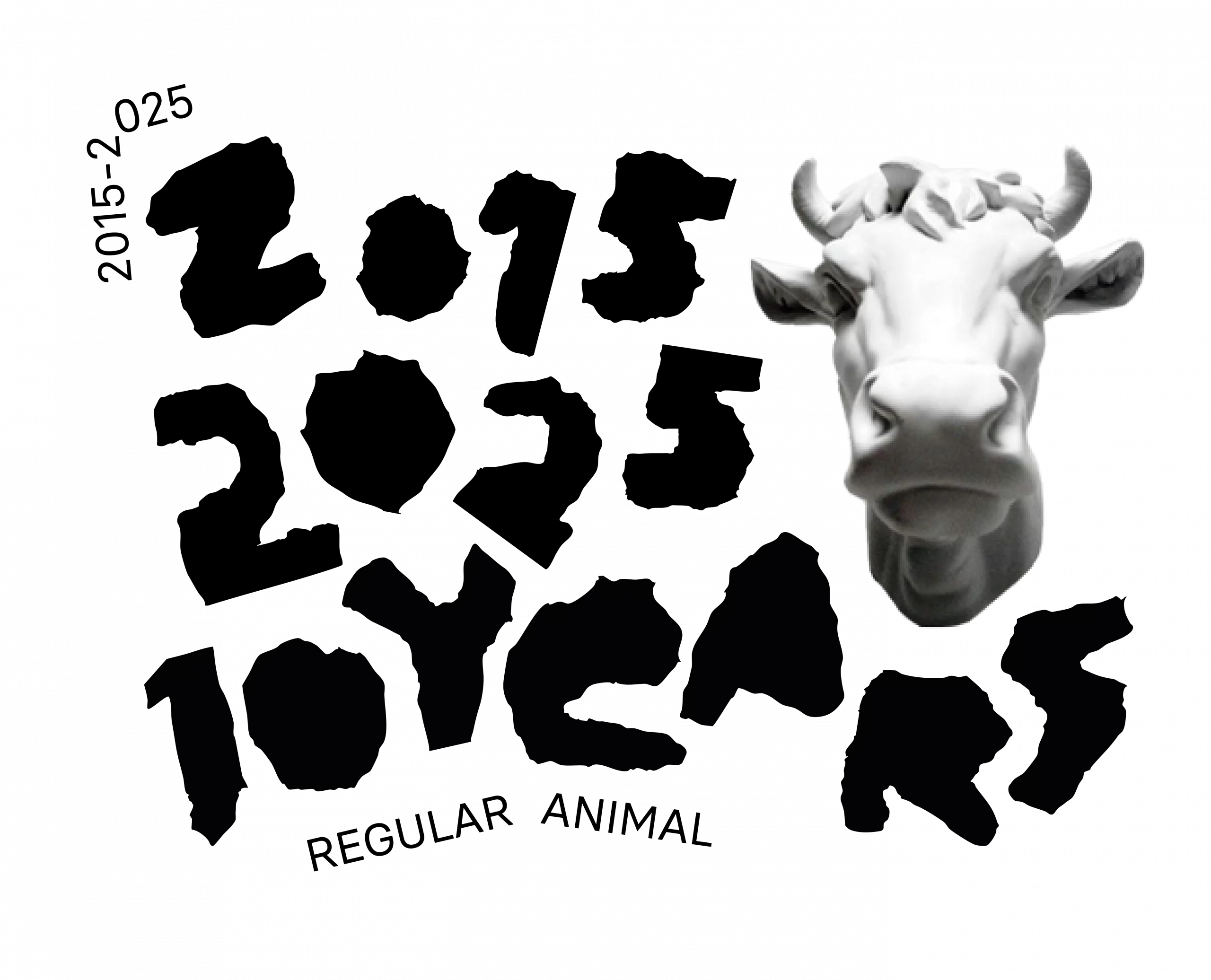
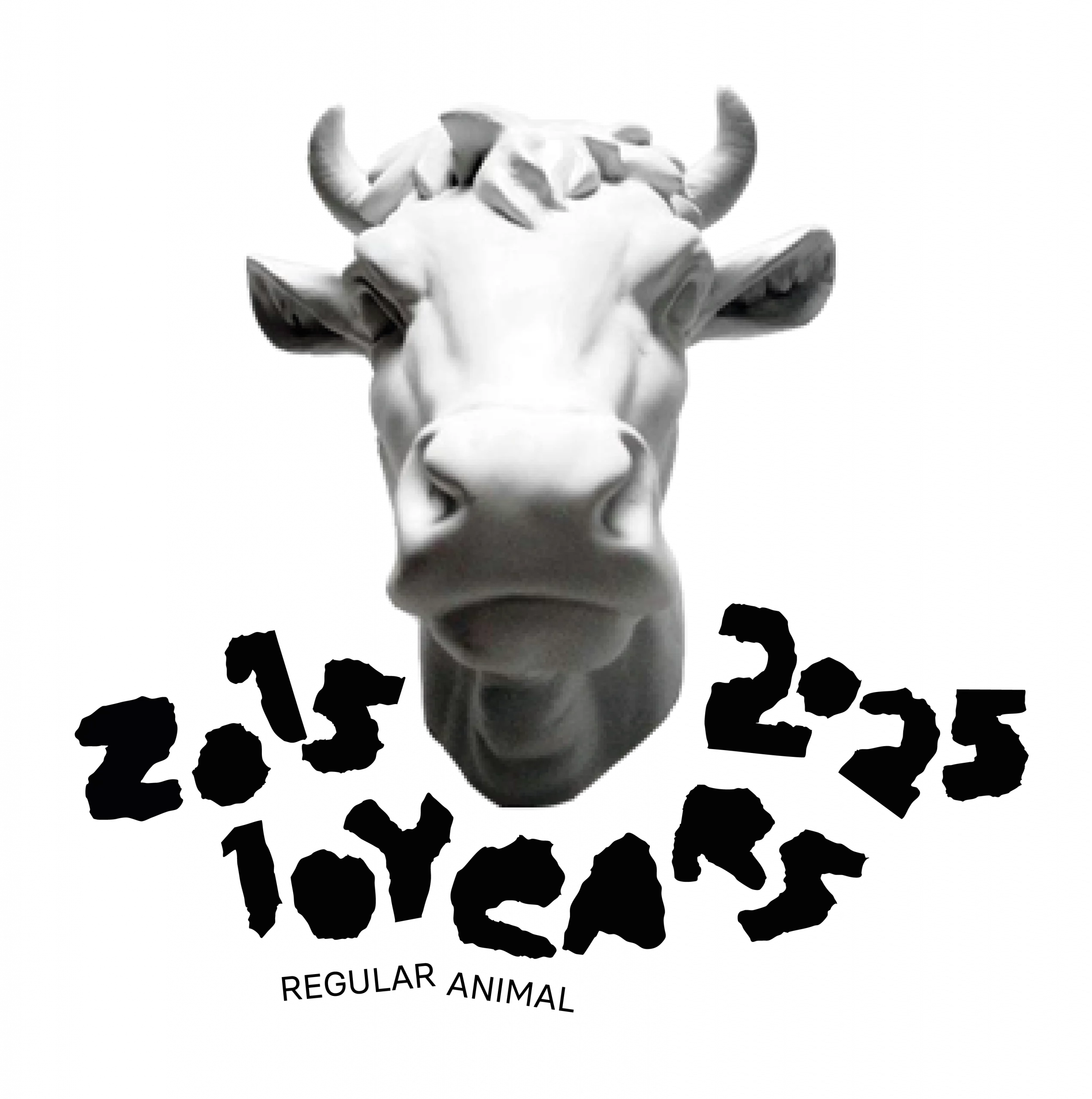
Regular Animal is a Miami-based creative agency dedicated to create content that makes exceptional brands shine. We bring your brand to life through Right Thoughts, Right Words, Right Actions™—inspiring branding, sleek graphic design, user-friendly websites, and compelling copywriting.